Kód: 04365343
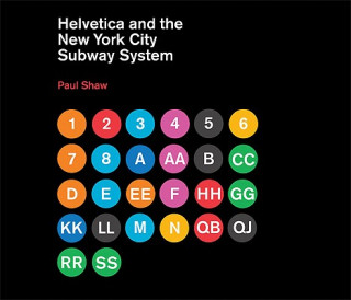
Helvetica and the New York City Subway System
Autor Paul Shaw
For years, the signs in the New York City subway system were a bewildering hodge-podge of lettering styles, sizes, shapes, materials, colors, and messages. The original mosaics (dating from as early as 1904), displaying a variety ... celý popis
- Jazyk:
 Angličtina
 - Vazba: Pevná
- Počet stran: 144
Nakladatelství: MIT Press Ltd, 2011
- Více informací o knize

1172 Kč

Skladem u dodavatele v malém množství
Odesíláme za 10-14 dnů
Potřebujete více kusů?Máte-li zájem o více kusů, prověřte, prosím, nejprve dostupnost titulu na naši zákaznické podpoře.
Přidat mezi přání
Mohlo by se vám také líbit
-

New York Subway Architecture & Design Map
313 Kč -

Great New York Subway Map
408 Kč -

Happy Inside
543 Kč -

Dictionary of Aviation
778 Kč -

The Rebel League: The Short and Unruly Life of the World Hockey Association
473 Kč -

The New York City Subway: The History of America's Largest and Most Famous Subway System
315 Kč -

NASA Graphics Standards Manual Remastered Edition
969 Kč -

From the Platform 2: More NYC Subway Graffiti, 1983-1989
902 Kč -

Star Wars: Secrets of the Galaxy Deluxe Box Set
1602 Kč -

The History of Graphic Design. Vol. 2. 1960-Today
1477 Kč -

Trains: New York City Subway
234 Kč -

Star Wars - Imperial Handbook: A Commander's Guide
458 Kč -

Subway Art
517 Kč -

Writers United
420 Kč -

Colossus of New York
268 Kč -

Birth Partner's Quick Reference Guide and Planner
322 Kč -

Sinner
268 Kč -

Michael Storrings New York City Subway 500 Piece Puzzle
405 Kč -

Batman by Grant Morrison Omnibus Volume 1
1547 Kč -

Pokemon Epic stickers
196 Kč -

Reconstructive Foot and Ankle Surgery: Management of Complications
8516 Kč -

NASA Graphics Standards Manual
1745 Kč -

Endocrine Board Review 2021
6258 Kč -

You Are Enough
406 Kč -

Things That Matter: Overcoming Distraction to Pursue a More Meaningful Life
518 Kč -

Vegetable Grower's Handbook
487 Kč -

Friends: The Official Advent Calendar 2021 Edition
811 Kč -

Candlekeep Mysteries (D&d Adventure Book - Dungeons & Dragons)
1138 Kč -

What's Wrong with Economics?
377 Kč -

Jujutsu Kaisen, Vol. 17
224 Kč -

Stalking Dead
739 Kč -

Trapped in a Dating Sim: The World of Otome Games is Tough for Mobs (Light Novel) Vol. 1
324 Kč -

Maria Lassnig - Film Works
1236 Kč -

Soul Helper Oracle
482 Kč -

Alice's Adventures in Wonderland & Through the Looking-Glass
923 Kč -

Do It For Yourself (Guided Journal)
308 Kč -

Freakonomics Revised and Expanded Edition
401 Kč -

Book of Candle Magic
406 Kč -

A Beginner's Guide to the Stock Market
196 Kč -

Narrow Corridor
378 Kč -

Feminists Don't Wear Pink (and other lies)
268 Kč -

Peppa Pig: Dinosaurs! Sticker Book
196 Kč -

You Are Amazing
196 Kč -

Scott Pilgrim's Precious Little Life
302 Kč -

Egyptology
677 Kč -

One Piece, Vol. 43
223 Kč -

Valkyries
247 Kč -

Rendezvous With Rama
276 Kč -

Ptolemy's Gate
249 Kč -

How Would You Move Mount Fuji?
499 Kč -

Private Life of the Brain
302 Kč -

History of the Church from Christ to Constantine
356 Kč -

A Man and His Watch
992 Kč -

Children of Time
269 Kč -

Ultimate Stallone Reader
834 Kč -

Women
396 Kč -

Mort
433 Kč -

Energy Oracle Cards
605 Kč -

Dolphin Readers: Level 3: Just Like Mine & Wonderful Wild Animals Audio CD
267 Kč -

Activate! A2 Students' Book/Active Book Pack
603 Kč -

Shadow and Evil in Fairy Tales
618 Kč -

Underground Railroad
268 Kč -

Lonely Planet Pocket Madeira
249 Kč -

Oracle of Pluto
423 Kč -

Star Wars Inquisitor: Rise of the Red Blade
421 Kč -

Celtic Cable Crochet
521 Kč -

We Have Always Lived in the Castle
404 Kč -

Wit & Wisdom of Lee Kuan Yew
519 Kč -

Birds of Peru
1008 Kč -

2024 Instant Happy Notes Boxed Calendar
278 Kč -

Tools of the Ancient Romans
449 Kč -

Breathing in the Fullness of Time
548 Kč -

Handbook of Research Methods on Intuition
4567 Kč -

Adult Piano Course
279 Kč -

RADIANT WILDS TAROT
732 Kč -

Fresh Naked Girls
1403 Kč -

Dziewczyna, którą zapomniano
235 Kč -

Kubek niekapek Bambino
32 Kč -

Odolné dítě
268 Kč -

Resident Evil - Heavenly Island (Komplettpaket)
990 Kč -

Velká knížka Bagry pro malé vypravěče
177 Kč -

Mój mały elementarz. Szlaczki
11 Kč -

Polish-English Bilingual Visual Dictionary
312 Kč -

Fotovoltaika
207 Kč
Dárkový poukaz: Radost zaručena
- Darujte poukaz v libovolné hodnotě a my se postaráme o zbytek.
- Poukaz se vztahuje na celou naši nabídku.
- Elektronický poukaz vytisknete z e-mailu a můžete ihned darovat.
- Platnost poukazu je 12 měsíců od data vystavení.
Více informací o knize Helvetica and the New York City Subway System
Nákupem získáte 117 bodů
 Anotace knihy
For years, the signs in the New York City subway system were a bewildering hodge-podge of lettering styles, sizes, shapes, materials, colors, and messages. The original mosaics (dating from as early as 1904), displaying a variety of serif and sans serif letters and decorative elements, were supplemented by signs in terracotta and cut stone. Over the years, enamel signs identifying stations and warning riders not to spit, smoke, or cross the tracks were added to the mix. Efforts to untangle this visual mess began in the mid-1960s, when the city transit authority hired the design firm Unimark International to create a clear and consistent sign system. We can see the results today in the white-on-black signs throughout the subway system, displaying station names, directions, and instructions in crisp Helvetica. This book tells the story of how typographic order triumphed over chaos. The process didn't go smoothly or quickly. At one point New York Times architecture writer Paul Goldberger declared that the signs were so confusing one almost wished that they weren't there at all. Legend has it that Helvetica came in and vanquished the competition. Paul Shaw shows that it didn't happen that way--that, in fact, for various reasons (expense, the limitations of the transit authority sign shop), the typeface overhaul of the 1960s began not with Helvetica but with its forebear, Standard (AKA Akzidenz Grotesk). It wasn't until the 1980s and 1990s that Helvetica became ubiquitous. Shaw describes the slow typographic changeover (supplementing his text with more than 250 images--photographs, sketches, type samples, and documents). He places this signage evolution in the context of the history of the New York City subway system, of 1960s transportation signage, of Unimark International, and of Helvetica itself.
 Parametry knihy
Zařazení knihy Knihy v angličtině Economics, finance, business & management Industry & industrial studies Transport industries
1172 Kč
- Plný název: Helvetica and the New York City Subway System
- Autor: Paul Shaw
- Jazyk:
 Angličtina
 - Vazba: Pevná
- Počet stran: 144
- EAN: 9780262015486
- ISBN: 026201548X
- ID: 04365343
- Nakladatelství: MIT Press Ltd
- Hmotnost: 1040 g
- Rozměry: 244 × 288 × 19 mm
- Datum vydání: 11. February 2011
Oblíbené z jiného soudku
-

Wreck of the Penn Central
1161 Kč -

American Railroads
918 Kč -

Box
464 Kč -

Lost Tramways of Wales: South Wales and Valleys
250 Kč -

Air Babylon
356 Kč -

English for Cabin Crew
1456 Kč -

First Tycoon
523 Kč -

Airport Operations, Third Edition
1430 Kč -

Union Pacific
728 Kč -

Corn Belt Route
1351 Kč -

Erie Lackawanna
884 Kč -

Classic Jaguar XK
750 Kč -

Cruising Attitude
361 Kč -

Rover 800 Series
750 Kč -

Titanic Captain
540 Kč -

Aerotropolis
523 Kč -

Low Cost Carrier Worldwide
1828 Kč -

Lowe's Transport Manager's and Operator's Handbook 2021
1769 Kč -

Airport Design and Operation
7166 Kč -

Traffic Engineering Handbook 7e
4266 Kč -

Autocars Et Autobus Berliet
1748 Kč -

Deep Sea and Foreign Going
416 Kč -

Airworthiness
3552 Kč -

English for Cabin Crew: Audio CD
1009 Kč -

Branch Lines Around Portmadoc, 1923-46
738 Kč -

Aircraft Safety
1063 Kč -

Lighthouses
211 Kč -

Mapping the Airways
536 Kč -

Project Apollo: The Moon Landings, 1968 - 1972
518 Kč -

Towards Sustainable Aviation
1299 Kč -

Crash Detectives
356 Kč -

London by Design
631 Kč -

Transport Operator Licensing
1514 Kč -

Trains, Buses, People
1297 Kč -

Intercity Bus Lines Of The Southwest
521 Kč -

Rise and Fall of Harland and Wolff
507 Kč -

Union Pacific
730 Kč -

Fighting Traffic
1021 Kč -

British Aircraft Manufacturers Since 1909
614 Kč -

Safety is No Accident: From 'V' Bombers to Concorde
677 Kč -

Building Agreement
302 Kč -

Human Factors in Multi-Crew Flight Operations
2341 Kč -

Practical Aviation Security
3232 Kč -

Straight and Level
1612 Kč -

Sustainable Aviation Futures
5205 Kč -

Blue Funnel Line
595 Kč -

Buying the Big Jets
2108 Kč -

Air Confidential
493 Kč -

British Airways
614 Kč
Osobní odběr Praha, Brno a 12903 dalších
Copyright ©2008-24 nejlevnejsi-knihy.cz Všechna práva vyhrazenaSoukromíCookies


 Vrácení do měsíce
 571 999 099 (8-15.30h)